
The Entrepreneur Weekly
Join the Newsletter for one actionable strategy a week on marketing, entrepreneurship, and mindset
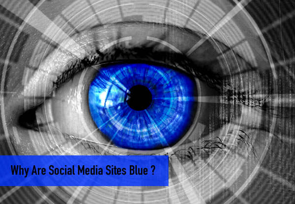
Why Are Social Media Sites Blue?
Blue pronounced: bloo (adjective)
Blue is the color of the sky and ocean. Ask someone to think about the color blue; not just what it reminds him or her of (read: sky or ocean);but more what it makes them feel. Chances are, after some real thought, they'll come up with some words like 'depth,' or 'strength,' or 'permanence.' Historically, blue symbolizes loyalty, confidence, relaxedness, trust, intelligence, faith, and even truth. Blue has also been scientifically proven to encourage creativity. It's pretty clear that the color blue benefits the mind and body in a number of ways.
Is it any surprise, then, that most major social media platforms, including Twitter, Skype, WordPress, LinkedIn, and of course Facebook, all use some shade of blue in their logos and throughout their website? Well, it's because the brilliant minds behind these platforms are using the color blue as a very specific marketing tool. Among the words and feelings we often associate with blue, the color also promotes interaction. And as aforementioned, studies show that blue encourages creativity;which, in a way, fosters a certain type of interface amongst people.
Let's go over a couple of the above-mentioned platforms, and each of their specific reasons for utilizing blue.
Skype uses blue to incite a feeling of innovation amongst its clients. Skype allows users to connect via text or video, which, when the application was first released, was a relatively new idea. Blue, for a platform like Skype, incites a sense of dependability (you'll be able to talk to your loved ones via text or video without worrying about disconnecting!);and that's very appealing.
WordPress uses blue on its website to encourage a sense of trust. Their reason for using the color is relatively straightforward: WordPress is a blogging platform, and it wants you to feel entirely comfortable bearing your soul; your content; to the Internet.
Facebook uses blue to encourage creativity and individuality. It's a gender-neutral color (despite our childhood memories of 'pink is for girls, blue is for boy'), and has an innate ability to hold people's attention. Unlike, say, white or red, it doesn't do much to affect the eye in a negative way. It's also an easy color to look at for long periods of time (maybe that's why we stare at our Timelines for so long without actually in-taking much information) All in all, Zuckerberg definitely got it right when he decided that Facebook's logo would be blue.
Blue is a welcoming color. Despite the fact that it often brings to mind thoughts of the cool blue ocean, it's a warm color. It both attracts the eye and simultaneously, calms. It encourages viewers to view content as inviting and friendly;useable, effective, and reliable.
Really, as long as your website is done well;as long as it communicates your brand in the way you so desire;any color-scheme will do. But why not take a page from the leaders of our Internet world, and portray these specific types of communication by using the color blue? Seems like a good idea to us.